
拓普
啤酒酵母领导品牌
背景:
唐山拓普生物承担的项目属于国家产业政策鼓励项目,位于环渤海经济圈和京津冀都市圈的核心地带——唐山市,总部设在开平区唐山现代装备制造工业园,西南距天津市区118公里,西北距北京市区164公里,两小时内可抵达首都国际机场。唐山拓普生物科技有限公司系现代生物高新技术企业,致力于酵母抽提物等系列产品的研发、生产与营销,属中央投资项目。 唐山拓普生物预计总投资6.5亿元人民币,已实现投资3.7亿元。公司占地180亩,其中绿地面积占18%,总建筑面积3.7万平方米。
Background:
Tangshan topology biological undertake project belongs to the national industrial policy to encourage project, located in the bohai economic circle and the heart of Beijing, tianjin and hebei metropolis circle - tangshan, headquartered in kaiping district of tangshan modern equipment manufacturing industrial park, southwest 118 kilometers away from tianjin city, northwest 164 kilometers away from downtown Beijing, can be arrived at the capital international airport in two hours. Tangshan topology biotechnology co., LTD is a modern biological high-tech enterprises, is committed to the yeast extract series products, such as research and development, production and marketing, belong to the central investment projects. Tangshan extension, with a total investment of 650 million yuan, according to the implemented investment of 370 million yuan. The company covers an area of 180 mu, of which green land area of 18%, a total construction area of 37000 square meters.


挑战:
由于酵母行业产品的单一性,以及消费者的浅层认知度,结合严峻的市场竞争体制下,唐山拓普科技也面临着互联网科技的更多机遇与挑战,本次先知集团与贵司签署了企业品牌创立,企业品牌标识优化,企业新产品的命名,品牌市场定位,和品牌后期销售策略与整合。先知团队本次根据生物科技行业特性创造出“拓普”企业名称,名称创作原点来自英文单词“TOP”寓意为顶级,最好之意。其TOP也预示着在生物科技链里发展到顶点之意。结合名称合法落地并可注册性,延伸为TUOPO。汉字取义“拓普”寓意开拓进取,扎实靠谱,诉说着产品的开发技术与产品的使用信誉,同时发音爽朗,便于记忆的国际化名称。先知命名团队在企业标志优化升级时考虑到标志设计是在大的生物科技的行业背景下基于唐山拓普自身的企业个性进行提炼创作而来。
Insight:
Because yeast oneness industry products, as well as consumers of shallow recognition, combined with the severe market competition system, tangshan t&p technology is faced with more opportunities and challenges of Internet technology, the Wewin group founded with your company signed a corporate brand, corporate brand identity optimization, enterprise name of new products and brand market positioning, late and brand marketing strategy and integration.The Wewin team according to biotechnology industry features to create the "topology" enterprise name, the name of the creation of origin from the English word "TOP" implication for the TOP, the best. Its TOP in biological KeJiLian development as well as to the vertex. Combined with the name of legal ground and can be registered, stretches for TUOPO. Moral characters take righteousness "topology" pioneering spirit, solid, telling the use of product development technology and product reputation, bright and clear pronunciation at the same time, the internationalization of easy to remember names. The Wewin named team logo in upgrading to take into account the logo design is under the background of big biotech industry based on the tangshan topology own corporate personality to refine the creation.
解决:
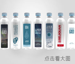
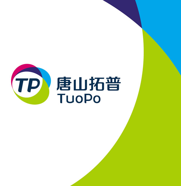
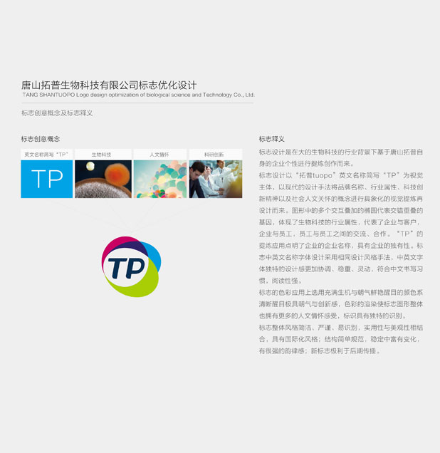
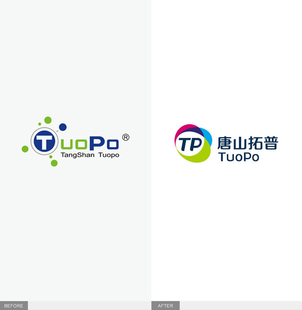
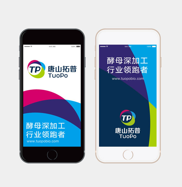
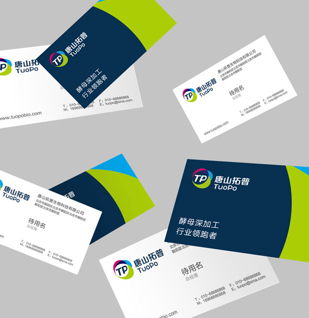
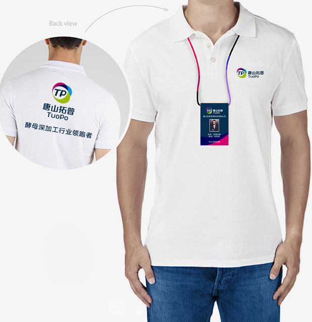
标志设计以“拓普tuopo”英文名称简写“TP”为视觉主体,以现代的设计手法将品牌名称、行业属性、科技创新精神以及社会人文关怀的概念进行具象化的视觉提炼再设计而来。图形中的多个交互叠加的椭圆代表交错重叠的基因,体现了生物科技的行业属性,代表了企业与客户,企业与员工,员工与员工之间的交流、合作。“TP”的提炼应用点明了企业的企业名称,具有企业的独有性。标志中英文名称字体设计采用相同设计风格手法,中英文字体独特的设计感更加协调、稳重、灵动,符合中文书写习惯,阅读性强。标志的色彩应用上选用充满生机与朝气鲜艳醒目的颜色系清晰醒目极具朝气与创新感,色彩的渲染使标志图形整体也拥有更多的人文情怀感受,标识具有独特的识别。标志整体风格简洁、严谨、易识别,实用性与美观性相结合,具有国际化风格;结构简单规范,稳定中富有变化,有很强的韵律感;新标志极利于后期传播。在名称与标识确定后,涉及到后期产品上线,包装,推广等事宜,先知策划团队,全力打造“全轻”母品牌,它是所有产品的总品牌,更是一种生活方式。旗下最先推出的酵母产品“酵他她”从命名到包装和后期传播完全由先知中国量身打造,在行业里受到了甄多好评。
Solve:
Logo design with "t&p tuopo" English name abbreviations "TP" as the main body in the visual, with modern design technique will be the brand name, industry attribute, science and technology innovation as well as the realization of the concept of the social humanistic care, refining to visual design. The ellipse of multiple interactions of a graphic overlay on behalf of the staggered overlapping genes, embodies the biotechnology industry attributes, on behalf of the enterprise and customers, enterprises and employees, communication and cooperation between the staff and workers. "TP" refining application points to the name of the enterprise, has the characteristic of the enterprise. Signs in both Chinese and English name of the font design using the same design style, unique in both English and Chinese font design feeling more harmonious, stable, clever, accord with Chinese habit, reading.Logo color application on choosing is full of vigor and vitality bright eye-catching colors are clearly marked sense of vitality and innovation, colour rendering make logo graphic whole also have more humanity feelings, identity has a unique identification. Integral style is concise, rigorous, easy to identify, practicality and aesthetics, the combination of cosmopolitan style; Rich change in simple structure specification, stable, strong sense of rhythm; New logo very conducive to spread of late.Late, after the confirmation of the name and identity involves products online, packaging, promotion, planning team, the Wewin to "light" brand, it is the total brand of all products, but also a way of life. Its first launch of yeast product "leaven him that she" from naming to packaging and later spread entirely by the Wewin made in China, has received the zhen much high praise in the industry.