
慈壹
新教育培训平台
背景:
慈壹艺术教育培训隶属国家正规注册培训平台,总部位于北京市朝阳区CBD核心区域,是一所集成人艺术培训(声乐、器乐、舞蹈)、青少儿才艺培训及才艺开发(声乐、器乐、舞蹈、美术)、艺术课程研发、艺考辅导、留学艺术辅导、企业服务(员工才艺培训、歌唱类或舞蹈类的辅导和编排、节目创作和指导、活动或晚会策划、提供演出人员等)、文艺演出、参赛培训、唱片录制、歌手培训、艺人推广、形象提升为一体的综合性艺术教育培训平台。
CiYi art education training under national formal registered training platform, headquarters is located in chaoyang district of Beijing CBD core area, is an integrated arts training (vocal and instrumental music, dance), green children's talent training and talent development (vocal and instrumental music, dance, fine arts), art curriculum research and development, the art exam, study art counseling, enterprise services (employee talent training, singing or dancing class tutoring and choreography, program creation and guidance, activities or party planning, provide the staff performance, etc.), theatrical performances, team training, training of the record, the singer, actor image promotion, promotion is a body comprehensive art education training platform.


挑战:
本次先知设计团队和命名团队,结合慈壹艺术教育培训机构以“为教学成就卓越”为使命,倡导孩子自由发展为导向。提炼treehouse美国家庭理念(树屋,就是家长在树上给孩子建的小木屋让他们玩的这是孩子们自由的私密的属于他们的空间)创意出本次标志的设计思路。
The design team and the prophet named team, combining CiYi art education training institutions to "for teaching achievement of excellence" for the mission, advocating children free development as the guidance. Refining treehouse American family concept (tree house, is the parents to the child in the tree built cabin let them play the children free private belongs to them space) ideas out of the logo design.
解决:
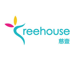
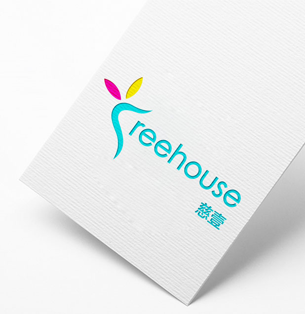
标志采用了“红、蓝、黄”现代化教育的代表色,分别传到了智慧、温馨、与活跃。标志巧妙的在英文单词字母”T“做了变形,S型的变化,和2片树叶的组合,体现了植物含苞待放的寓意生命与教育的象征。整体的字母标加上创意的图形结合出了本次富有灵性色彩的标志。
慈壹,核心创意源点来自"育行天下,始终如一",符合企业全方位、全过程、专业化的艺术教育服务内容,一个“慈”字将教育培训行业的特征诠释得淋漓尽致;名称字形简洁,发音容易,通俗易懂,符合命名美学原则,便于消费者识别与记忆,利于品牌形象的传播。 配合一个“壹“字巧妙的融合了教育以人为本,始终如一的服务理念。
Sign a "red, blue, yellow" the representative of the modern education, respectively to the wisdom, warmth, and active. Logo ingenious words in English letter "T" do deformation, the change of S type, and the combination of 2 leaf, embodies the moral life of plants in bud and a symbol of education. Overall letters and creative graphics combined with out the rich spiritual color logo.
CiYi, core creative source point from "education world, consistent", in line with the enterprise comprehensive, whole process and professional art education service content, a word "kindness" explain the characteristics of the education and training industry to get incisively and vividly; Pronunciation name glyph is concise, easy, easy to understand and conform to the naming aesthetic principles, convenient for consumers to identify and memory, conducive to the spread of the brand image. With a "one" word skillfully combines the education with the person this, consistent service concept.