凯格朗泰
聚力开创民族品牌新格局
背景:
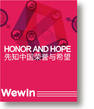
要成立的新公司主要服务项目是电气设备、制冷设备,发电机产品销售,安装维护。计算机软硬件开发销售,计算机、电子、生物、医药、汽车技术领域内的四技服务,生物工程及生物制品研制、开发、销售,整流器生产、开发,计算机网络工程,电脑网络软件开发。公司领导经过多家公司考察,最终选定先知中国命名为其提供品牌系统解决方案。
Background:
To set up the new company's main service projects are electrical equipment, refrigeration equipment, generator product sales, installation and maintenance. Computer hardware and software development and sales, computer, electronics, biology, medicine, automotive technology in the field of four technical services, bio engineering and biological products research, development, sales, rectifier production, development, computer network engineering, computer network software development. Company leaders through a number of companies to investigate, the final choice of the Wewin named after the Chinese brand system solutions.


挑战:
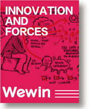
先知调研及命名团队经过大量的调研及数据分析,圈定其主要的竞争对手为电气类:(进口)施耐德、西门子等(国产)香江、亿能;制冷类:开利、约克、特灵;发电机:卡特彼勒、科勒、康明斯等。如何区隔与以上竞品品牌是本次工作的重点。先知团队通过深层挖掘行业相关品牌内涵和企业价值观,最后的出创新,安全,诚信,整合四个企业个性作为命名创意点,之后与企业高层进行多次交流协商,最终确定以体现企业创新为核心命名原点。
Challenge:
Research the Wewin and named the team after a lot of investigation and data analysis, delineation of the main competitors for electrical: (imports) Schneider, Siemens, etc. (domestic) Hong Kong, Yineng; refrigeration, carrier, York, Trane; generators: Caterpillar, Kohler, Kang Mingsi. How to separate with the above competing brands is the focus of this work. The Wewin team through the deep mining industry related brand connotation and corporate values, and finally out of innovation, security, integrity, integration of four corporate personality as named creative point, after several exchanges and consultations with the corporate executives, and ultimately determine to reflect the enterprise innovation as the core of the origin of life.
解决:
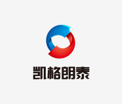
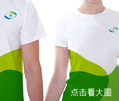
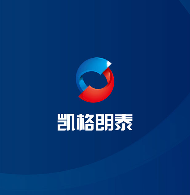
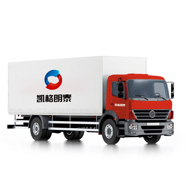
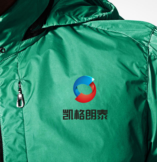
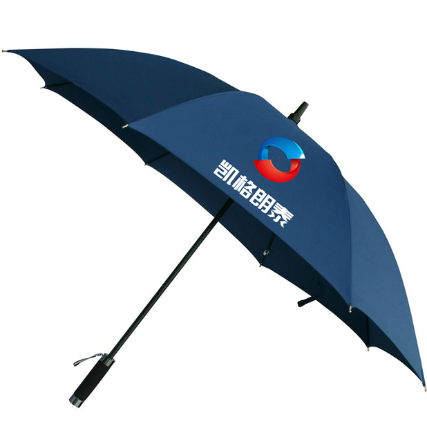
最终定名凯格朗泰,格,别具一格;泰,首屈一指;体现了创新性和权威性;“凯”和“朗”颇为西式,为整个名称增添了诸多国际化色彩。名字豪迈大气,将贵司技术创新和追求卓越的品质充分体现了出来,稳重不失活力,字体结构端正,容易识别。品牌设计解读,地球:标志由两个半圆旋转交互而形成的圆形,首尾相连,生生不息;红色传达活力,积极,热诚,动力,红色具有很好的视觉效果,蓝色表现出一种博大、科技感,同时蓝色也是永恒的象征;符合企业的行业属性。共赢:首尾相连的两个半圆图形,代表携手共进,提振信心,共同发展。聚焦:聚焦为一点,企业团结发展,赢得行业第一美誉。
Solve:
Eventually named name explanation: lattice, unique; Thai, second to none, and embodies the creativity and authoritative; "Kay" and "Lang" quite western style, for the name of the entire add many of the international color. Name the heroic atmosphere, a noble our technological innovation and pursuit of excellence quality fully reflected, sedate do not break vitality, correct font structure, easy to recognize. Brand design interpretation of the earth: mark formed by two semicircular interacting spins round, end-to-end, endless; red convey vitality, energetic and enthusiastic, dynamic, red with very good visual effects, blue shows out a broad sense, science and technology, and at the same time, blue is also the symbol of eternity; in line with the industry attribute of enterprises. Win: two semicircles end to end, representatives work together to boost confidence, common development. Focus: focus as a point, the unity and development of enterprises, the industry won the first in the world.