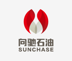

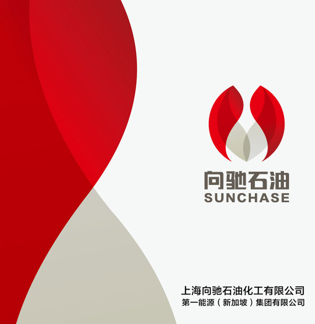
向驰
新加坡第一能源
本次项目背景是第一能源(新加坡)集团有限公司 上海分公司的标志创新与企业命名。本次命名与标志设计任务难点是,向驰石油,一家新加坡子公司,如何在华落地化,并且更好的适应时代的发展,从命名到标志设计服务。企业原有的标识已经不能满足日益发展的互联网化经济,同时颜色又过于单一,在同行业竞争里无法达到差异化,无法达到更好的视觉效果,并且拥有符合自己的独特气质的标识,和好的企业名称。考虑这些因素,企业希望通过先知命名团队和设计团队,来一次名称创意和标志优化创新的整体升级。
The background of this project is the first energy (Singapore) group co., LTD. Shanghai branch symbol of innovation and enterprise name.The name and logo design task difficulty is to chi oil, a subsidiary in Singapore, how to be born in China, and to better adapt to the development of The Times, from naming to logo design services. Enterprise original logo already can not meet the development of the Internet economy, at the same time, color is too single, in the same industry competition cannot reach differentiation, unable to achieve better visual effect, and have identified in line with their own unique temperament, and good enterprise name. Considering these factors, the enterprise hope that through the prophet named team and design team, to sign a name ideas and optimize innovation overall upgrade.


挑战:
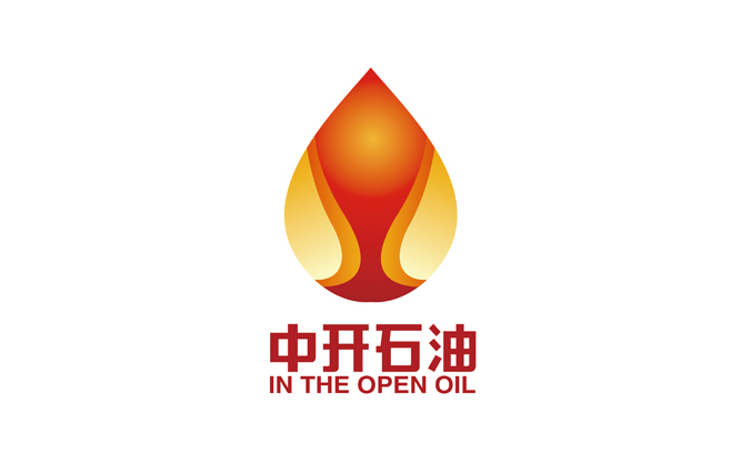
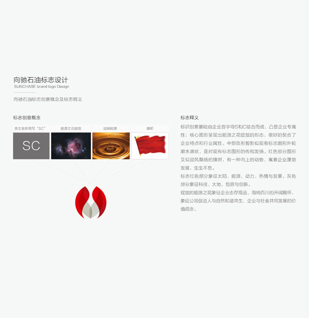
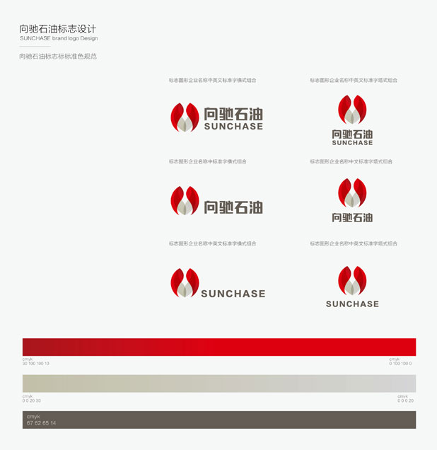
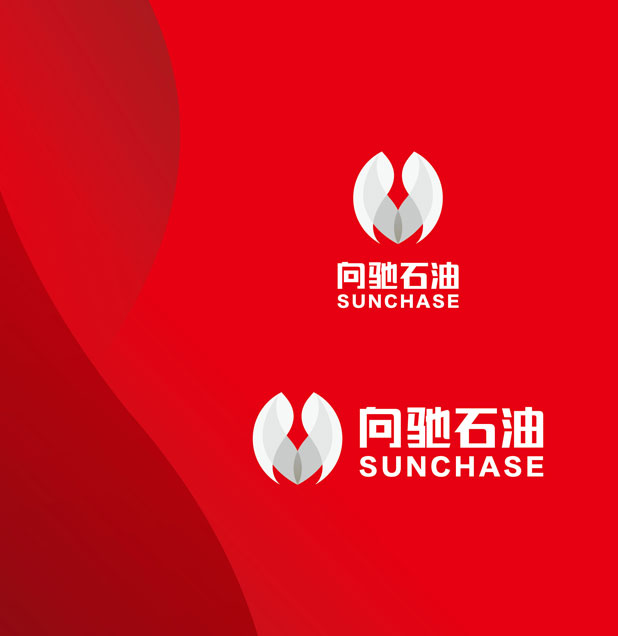
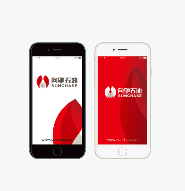
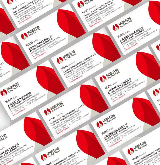
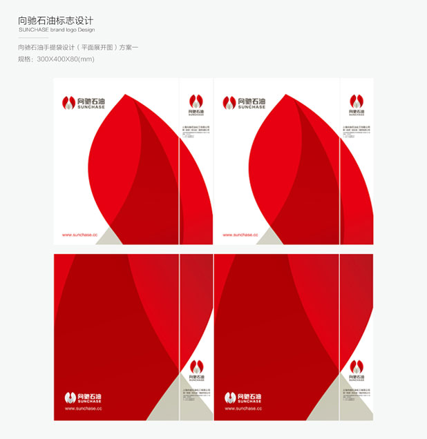
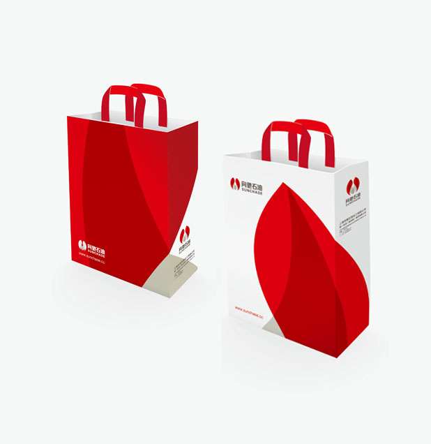
标识创意基础由企业首字母S和C结合而成,凸显企业专属性;核心图形呈现出能源之花绽放的形态,很好的契合了企业特点和行业属性。中部负形剪影似现有标志图形外轮廓水滴状,是对现有标志图形的传和发扬。红色部分图形又似迎风漂洋的旗帜,有一种向上的动势,寓意企业蓬勃发展,生生不息。
Identify creative basis by the enterprise on the combination of the first letter S and C, highlight enterprise specificity; Core graphics presented flowers bloom forms of energy, good fit the characteristics of enterprises and industry attributes. Negative space in central silhouette as existing logo graphic outer contour teardrop-shaped, is the spread and carry forward of existing logo graphic. Like the wind drift out of the red part of graphics and flags, have a kind of upward emfs, implication enterprise vigorous development, endless.
解决:
标志红色部分象征太阳、能源、动力,热情与发展。灰色部分象征科技、大地,包容与创新。
绽放的能源之花象征企业志存高远、海纳百川的开阔胸怀,象征公司促进人与自然和谐共生、企业与社会共同发展的价值观念。
向驰,名称创意源自英文“sunchase”,sun代表太阳,代表阳光,也是向的英文释义,表明企业的未来犹如阳光一样欣欣向荣。驰,寓意着飞驰,万马奔腾的一种气势,用英文chase寓意为追的意思,引领了企业时代前沿的发展。向驰,整体读音完整,读音上扬,易于国际化的传播与大众的记忆。
Mark red symbolizes the sun, energy, power, passion and development. Grey part of the symbol of science and technology, the earth, tolerance and innovation.
Blooming flower symbol the energy enterprise ideals, all rivers run into sea, open mind, symbol company promote harmonious coexistence between man and nature, and social values of common development.
To chi, name inspired by English "sunchase", sun represents the sun, on behalf of the sun, is also to English interpretation, shows that the enterprise's future is like the sun. Chi, the significance of speeding, energizes a momentum, chase chase was meant to mean in English, has led to the development of cutting-edge enterprises. Up to chi, complete the overall pronunciation, pronunciation, easy to international communication and the public's memory.