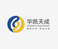
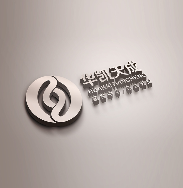
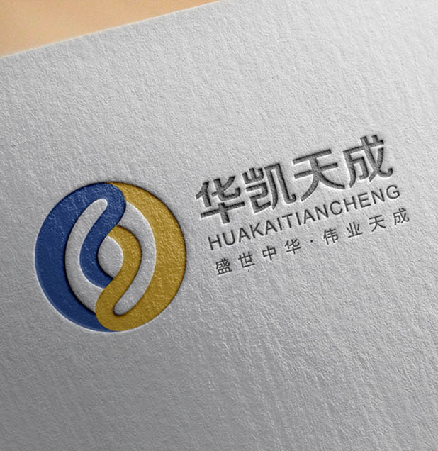
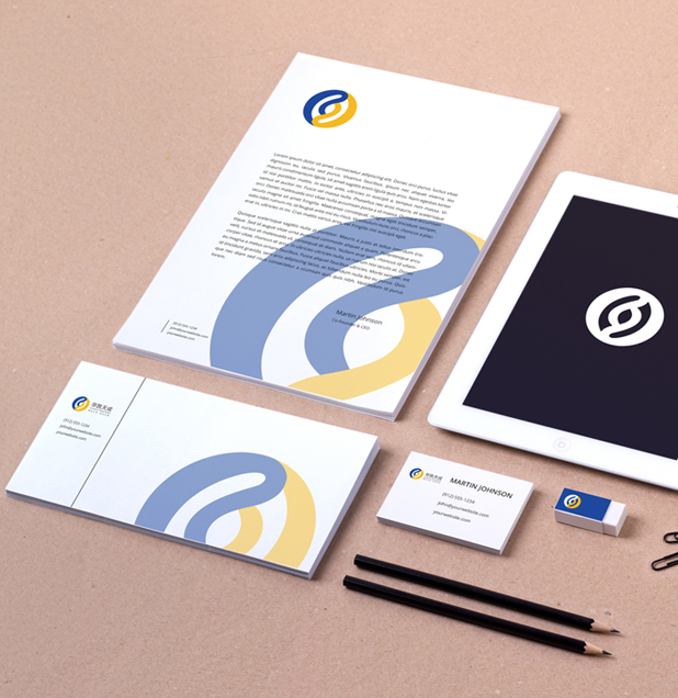
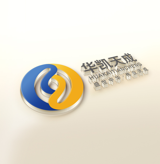
华凯天成
盛世中华,伟业天成
项目名称:
山西临汾新成立的意见商贸公司,先知创意团队为其中文名:华凯天成,易理含义:(37)权威显达得众望,忠实热诚运吉昌,大德奏功无难事,终得富荣乐康旺,逢凶化吉,吉人天相,风调雨顺,生意兴隆,常营事业,能步步得到建立大业发达成功之吉数之格(大吉)。名称释义:名称创意理念来源于“盛世中华,伟业天成“,传达出企业在针织商贸领域的宏大战略布局,该名称用字简洁,发音上口,中式化特征尤为明显。体现出贵司雄厚的商贸实力,明显区隔于同行业企业名称,易于企业的识别与传播。
Project Name:
Linfen newly formed opinions commerce company, its Chinese name prophet creative team: Huakai Tiancheng, Name Definition: The name of creative ideas from the "golden age of Chinese, Albert Tiancheng" convey the enterprise in the field of knitting commerce grand strategic layout, the name with the word concise, catchy pronunciation, especially Chinese Characteristics. It reflects the strength of your company strong trade significantly differentiate in the same industry business name, easy to identify and disseminate business.


logo释义:
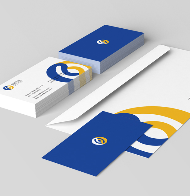
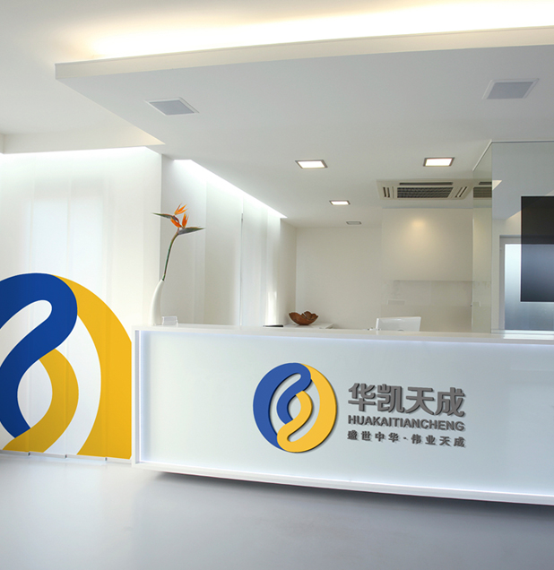
临汾华凯天成商贸有限公司作为一支新生代力量,先知中国设计团队通过探讨与分析,首先把针织品、太极符号、互通贸易、全球化等概念融合为一,体现企业多样化、国际化发展之路;标识中间犹如一根根毛线相互缠绕,形成一个“互”字,体现企业的行业属性特征以及互助合作,和谐发展的经营理念,也象征着企业员工犹如鹰群自由翱翔于天空之中,积极向上、团结奋斗的拼搏精神;太极,则是中国古典文化的象征,剑指企业秉承用心服务,诚信至上的核心理念为客户服务;标识运用了多种古典元素,也代表着地域性文化,彰显企业文化特色和充满生机勃勃的生命力、创造力。
logo Interpretation:
Linfen Huakai Tiancheng Trading Co., Ltd. as a new generation of power, the Prophet Chinese design team through discussion and analysis, first the concept of knitwear, tai chi symbol, exchange of trade and globalization together as one, reflecting business diversification and international development road; identifying middle like a root wool intertwined, forming a "mutual", which reflect the characteristics of the enterprise and industry attributes mutual cooperation and harmonious development of philosophy, the culture and integration of world trade trends, build a world-class business hub of knitwear.
品牌策划:
标识整体由”中国“古代书法里的”国“字写法而来,凸显企业文化底蕴深厚,扎根于中国传统与现代文化,将文化与世界贸易发展趋势相融合,打造世界一流的针织品贸易枢纽港。标志采用黄色、蓝色为主色调,在中国传统里,黄色则象征着温暖、鲜艳,给人活泼、甘美、富丽、明 朗、亲切和充满朝气的感觉,是翘盼东方冉冉升起的太阳!寓意着企业员工之间包容、团结、合作、诚信,是企业在行业中处于领导地位,蓝色象征着宽广、纯净、大海、悠闲,是生活品质的提高和追求。把企业文化和形象设计统一考虑,让品牌具有系统化的竞争力。
Brand planning:
Logo uses yellow, blue color, in Chinese tradition, yellow symbolizes warmth, bright, friendly, lively, sweet, rich, bright, friendly and vibrant feel, is eagerly look forward to the east rising sun! Meaning the inclusion among employees, solidarity, cooperation, integrity, corporate leadership position in the industry, the blue symbolizes the broad, clean, sea, leisure, is to improve the quality of life and the pursuit. The unified corporate culture and image design consideration, so that the brand has a systematic competitive.