
坤厚环保
坤厚载物 德合无疆
项目背景:
内蒙古天一环境技术有限公司(简称:天一环境)2011年由内蒙古自治区外国专家局引进,目前落户于呼和浩特市留学生创业园。是目前世界上唯一掌握介电电泳产业化应用核心技术的研究机构及专业公司,作为能使众多高新技术产业取得突破性进步的共性基础技术,介电电泳产业化应用技术已经应用于无污染矿物分离、水处理领域,生物领域、新材料及新能源等领域,无一不为上述领域带来了革命性的技术进步。而这项集捕获、分离、富集、传输、纳米粒子操控于一体的全新技术,能够实现其产业化应用的只有内蒙古天一环境技术有限公司及所属的内蒙古介电电泳应用技术研究院,全球范围的介电电泳产业化应用方面公开发表的所有专著、专利及论文全部为天一环境团队所有。
Background of the project:
Inner Mongolia Tianyi Environmental Technology Co., Ltd (Tianyi Environment for short). It’s introduced by the the Inner Mongolia Autonomous Region Bureau of foreign experts in 2011 and currently located in Hu Hehaote Oversea Students high-tech business incubator. It’s the only research institutions which grasp the core technology dielectrophoresis of industrial application in the world. As the common supporting technology that can make many high-tech industries have a breakthrough progress, dielectrophoresis industrial application technology has been applied in the fields as no pollution mineral separation, water treatment, biology, new materials, new energy and etc.. All has brought a revolutionary progress in technology.


解决方案:
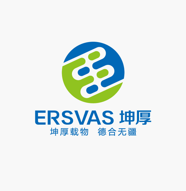
先知命名团队从周易坤卦出发,为其命名“坤厚”,寓意“坤厚载物,德合无疆”,命名格局大气,寓意宏大,是对公司未来的美好展望,同时又富有文化含义。
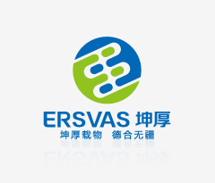
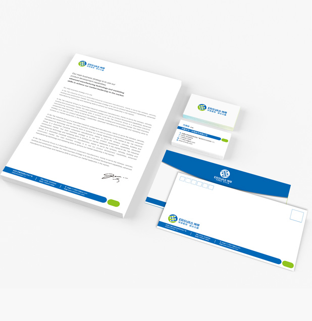
标志整体视觉协调、统一、简练、精致,以圆形为基础形状,代表中国传统文化里的“天”,与坤厚品牌释义“坤厚载物——大地宽厚而能载万物”形成天圆地方的 大格局,和中国传统文化相合;整体造型又结合了易经八卦,静动相生,形成生生不息的感觉;线条流畅,富有传统文化中“和谐”的精神。整体造型和谐统一,给 人以包容、大气感。
The solution:
Wevin naming team started from Zhou Yi Kun Gua and naming it "Kunhou", which means "good and generous enough to bear things". The naming pattern is big and grand and contains expectations for the future of the company as well as rich cultural meaning.
The overall visual sense of the mark is coordination, unity, concise and delicate. The basic shape is round, which represents the heaven in Chinese traditional culture. It’s comform to its naming pattern as well as Chinese traditional culture. The overall shape combined with ZHOUYI philosophy, static and dynamic live together, formed the feeling of life last forever. Besides, the smooth lines have rich traditional culture "harmony" spirit. The overall shape is harmony and unity, and give people a sense of contain and bounty.
解决方案:
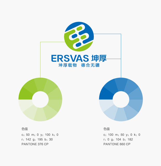
标志颜色以蓝绿为主,体现出坤厚集团科技、环保的企业属性:蓝色代表天空海洋和清洁,广阔而干净;绿色代表大地、草原和生命,不仅寓意承载,还指出了坤厚所处的地域——蒙古草原。
标志内含紧握的双手的抽象图形,寓意合作共赢,和谐发展;蓝绿色也是地球的主体颜色,代表公司企业全球化的定位;字母“E”的抽象化设计,是品牌英文名的首字母,同时组成了易经里的坤卦,与品牌名“坤厚”相合,寓意“坤厚载物,德合无疆”。
从整体上来说,LOGO完美的诠释了品牌名称“坤厚”的包容、大气,用图形语言诠释了企业的属性和所属行业。图形与品牌名结合,形成完美和谐的整体。
The solution:
Logo color is blue and green based, manifests the enterprise attribute of Kunhou group. Blue represents sky, ocean, clean and broad. The green represents the land, grassland and life. It’s not only means moral bearing, also pointed out the area of Kunhou -- the Mongolia grassland.
The abstract graph clenched hands means the cooperation, win-win, harmonious development. Blue and green are the earth's main colors, on behalf of positioning the globalization of company enterprise. The abstract design the letter "E", is the initial word of the brand English name, which conforms to its Chinese name.
On the whole, the LOGO is a perfect interpretation of the contain and bounty of the brand name "Kunhou" . Using graphical language to interpret the enterprise property, binding figure and brand name to form a whole perfect harmony body.