劳动人事争议仲裁委
背景:
劳动争议仲裁委员会是指县、市、市辖区设立的裁处企业与职工之间发生的劳动争议的组织机构。劳动争议仲裁委员会不按行政区划层层设立。劳动争议仲裁委员会由劳动行政部门代表、工会代表和企业方面代表组成。劳动争议仲裁委员会组成人员应当是单数。劳动争议仲裁委员会依法履行职责: 聘任、解聘专职或者兼职仲裁员、受理劳动争议案件、讨论重大或者疑难的劳动争议案件、对仲裁活动进行监督。本次北京市劳动人事争议仲裁委员会委托我方进行LOGO设计、VI设计等品牌服务项目。
Background:
Labor dispute arbitration commission refers to the organization of labor disputes between enterprises and employees of the enterprises and employees of the counties, cities and municipal districts. The labor dispute arbitration commission shall not set up in accordance with the administrative divisions. The labor dispute arbitration commission shall be composed of the representatives of the labor administrative departments, trade unions and enterprises. The labor dispute arbitration committee shall be composed of a single person. The labor dispute arbitration commission shall perform their duties: appointment and dismissal of full-time or part-time arbitrators, acceptance of labor dispute cases, discuss important or difficult cases of labor disputes, arbitration activities supervision. The Beijing municipal labor and personnel dispute arbitration commission commissioned by our LOGO design, VI design and other brand service projects.


洞见:
各个政府标志有各个政府标志的的定位和特色。如何突出自己的特色,打好特色牌?要有与众不同的色彩,才能在众多形象中脱颖而出。一个政府标志的形象其实在一定意义上也反映了一座城市的形象。我们应围绕北京市劳动人事争议仲裁委员会的特色进行挖掘,为其量身到造出适合怎神特色而又与同行业标志形象区隔明显的品牌符号。
Insight:
All the government signs have the orientation and characteristic of each government sign. How to highlight their own characteristics, playing a good character? To have a different color, in order to stand out in many image. The image of a government logo actually reflects the image of a city in a certain sense. We should focus on the characteristics of the Beijing municipal labor and personnel dispute arbitration commission to dig, for the amount of the body to create a suitable for how God features but with the same symbol of the industry and the image of the brand symbol.
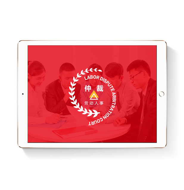
解决:
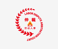
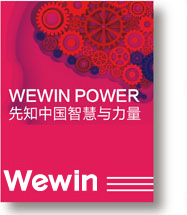
在我国大部分政府网站以红色做为主色调,色彩鲜艳,引人注目,具有强烈的感染力。同时它也在各种媒体中被广泛的利用,除了具有较佳的明视效果外,更被用来传达热情、积极、活力、前进等涵义的政府、企业形象与精神,还常常作为有攻击性的、严格的、代表权力的象征色彩进行使用。本次LOGO设计过程中我们以红色为主色调,以象征公平、公正的三角形为核心图形,把北京市劳动人事争议仲裁委员会的气质展现淋漓尽致。
Solution:
Most of the government websites in our country are mainly in red color, bright color, eye-catching, with strong appeal. At the same time, it also in a variety of media is widespread utilization, in addition to the photopic effect is better, more be used to convey enthusiasm, positive, dynamic, forward, and so on the meaning of the government, corporate image and spirit, often as aggressive, strict, representing the power of the symbol color to use. This time LOGO design process we take the red as the main color, in order to symbolize the fair, the fair triangle is the core figure, the Beijing city labor personnel dispute arbitration committee's makings display vividly.