
京铁物流
传统国有企业再造品牌新活力
京铁物流有限公司是北京铁路局全资的专业化物流企业,是以铁路运输为主,集铁路、公路、航空等多式联运为一体的第三方物流综合服务供应商,在京、津、冀、鲁等地设有11家子、分公司,营业网点遍布北京铁路局各大货运站,在乌鲁木齐、成都、昆明、贵阳、重庆等地设有办事处。
Beijing Railway Logistics Limited is a wholly owned Beijing Railway Bureau, the specialized logistics companies, rail transport is based, railways, highways, aviation and other multimodal transport as one of the third-party logistics service provider in Beijing, Tianjin, Hebei , Shandong and other places with 11 shijiazi, branch offices, sales outlets throughout the Beijing Railway Bureau, the major freight station in Urumqi, Chengdu, Kunming, Guiyang, Chongqing and other places have offices. In the competitive market.


公司以丰富的物流产品为依托、以运输方式多样化为特点、以完善的物流网络为支撑,为客户办理全国铁路整车、集装箱、拼装车为主的货运业务;特快/快速货运班列、行李车为主的行包业务;市内配送、长途运输为主的公路运输业务;国内航线为主的航空运输业务,提供货物发到、配送、仓储、包装为一体的全程物流服务。
Based on its abundant logistics products, diversified transportation, and perfect logistics network, the company provides its clients with following businesses: freight businesses; Luggage business; Road transport businesses; Domestic air transport operations. Currently it has established long-term, stable cooperation relationships with various enterprises in the field of IT,
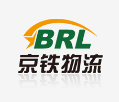
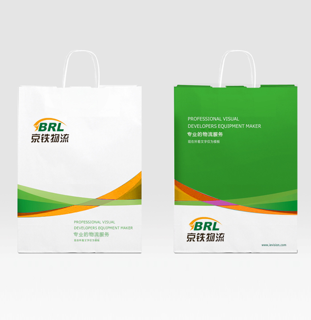
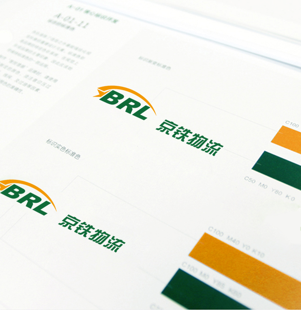
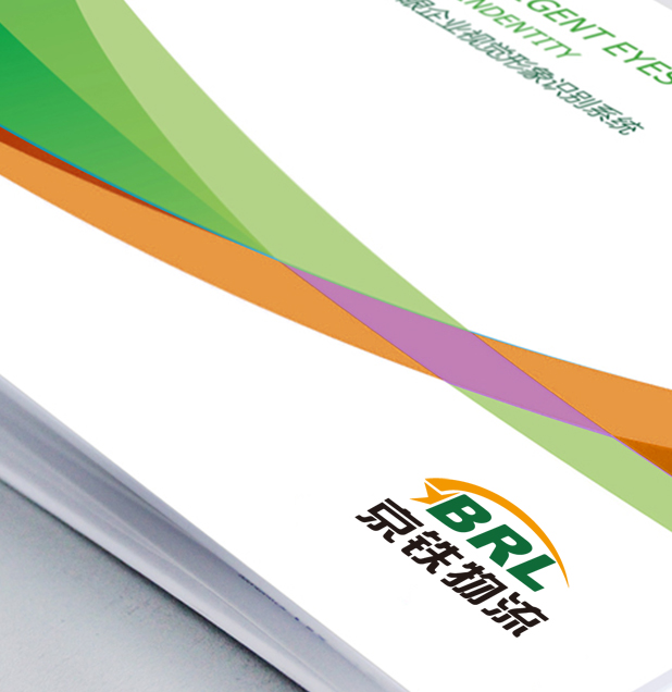
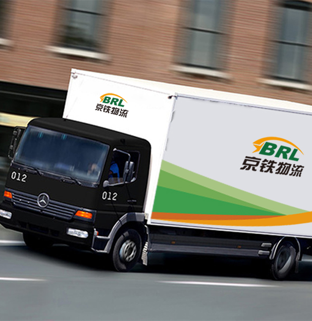
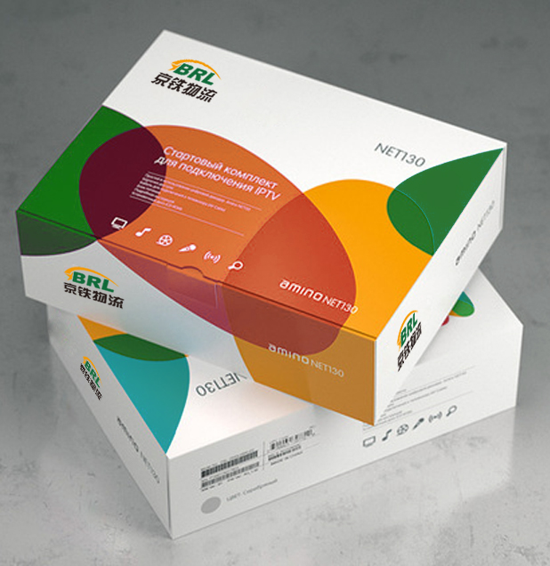
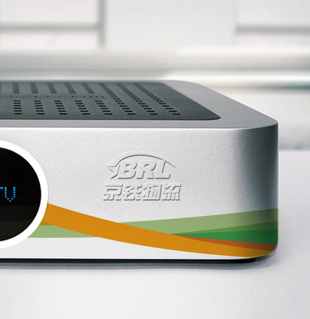
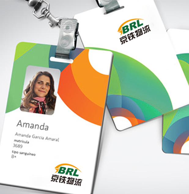
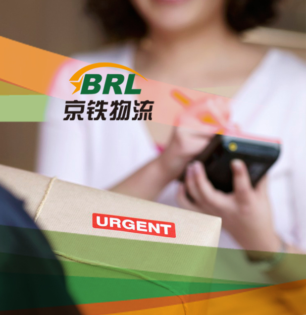
京铁物流的形象主要有三种颜色构成,从上到下依次是:橘黄色的图标、绿色的英文名缩写和黑色的中文名。橘黄会给人一种温暖的感觉,而绿色则会带给人活力与希望,黑色则会给人以理性、踏实的感觉,这样,公司形象就会传达出一种既稳重踏实有活力四射的感觉,容易赢得消费者的信赖。
Beijing Railway Logistics LOGO are three colors, top to bottom: the orange icons, green and black of the English abbreviation of Chinese names. Orange give people a feeling of warmth, while the green will give people energy and hope, the black will give a rational, practical sense, so that the company LOGO will convey both a prudent and realistic with vibrant feeling, easy to win the trust of consumers.