
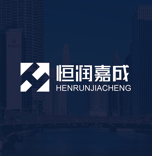
恒润嘉成
背景:
恒润嘉成天津有限公司是集国际航空客、货运、物流服务一条龙体系公司;国际市场出境游、国际租车;航空器、设备融资等经营范围的天津本土化企业。企业的品牌架构及未来三到五年的发展规划是要像国际化品牌进军,采用集团式管理,拓宽海外分支和扩大市场认知,并提高收益。本次服务企业需要先知为其提供集团化名称的创作,和企业标识的原创设计。
Background:
Constant embellish jiacheng tianjin co., LTD. Is a collection of international air passenger and freight, logistics, service one-stop system company; Outbound tourism, international car rental international market; Aircraft, equipment financing, business scope of tianjin local enterprise.Brand architecture of the enterprise and the development of the next three to five years planning is like the internationalization of the brand, the political management, expand overseas branches and expand market recognition, and increase profitability. The service enterprises need the Wewin with the creation of the group name, and the original design of the corporate logo.


解决:
先知命名团队在准确的分析企业定位与目前市场发展需求下,集合公司未来集团化发展,并在本土先生根,后续发展国际化的基础下,创做出“恒润嘉成”大气、简洁、爽朗、集团化、国际化的企业名称,“恒润嘉成”恒,代表永恒,持续。也是企业未来发展轨迹。润,代表水,天津港口与国际空港的发展离不开水,水生万物,预示企业的未来发展。嘉成,则诠释了企业本身的诚恳信实的服务理念,有志者事竟成,正是源于此。先知团队通过巧妙的名称,完美的演绎了一个集团化公司的名称。
Solve:
Wewin named team in the accurate analysis of corporate positioning and current market development needs, the collectivization development set the future of the business, and Mr Root at home, the foundation of subsequent development of internationalization, and make "constant embellish jiacheng" atmosphere, concise, bright and clear, collectivization and internationalization of enterprise name, "constant embellish jiacheng" constant, represents the eternal, to continue. Also is enterprise's future development path. Embellish, on behalf of the water, the development of tianjin port and international airport without water, aquatic everything, predict the future development of the enterprise. Jiacheng, interpretation the honest faithful service concept of the enterprise itself, where there is a will there is a way, it is from then on. The Wewin team with a clever name, perfect deduce a collectivize company's name.
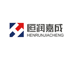
延展:
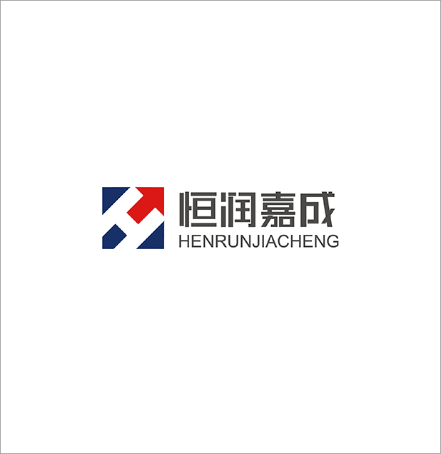
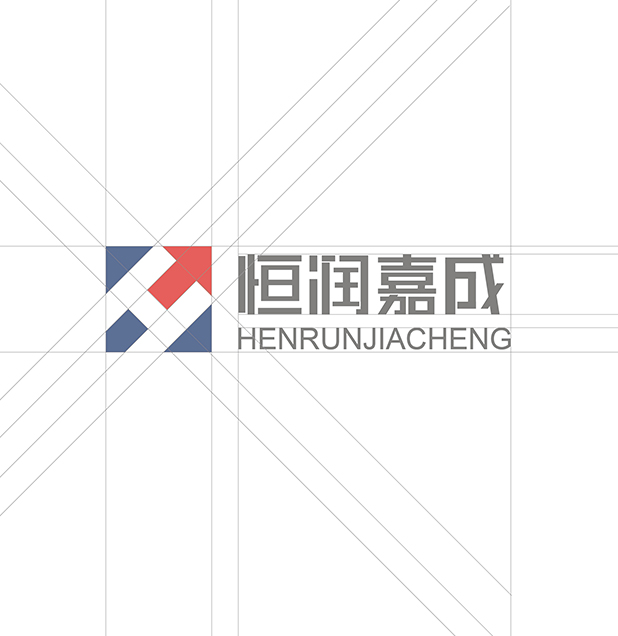
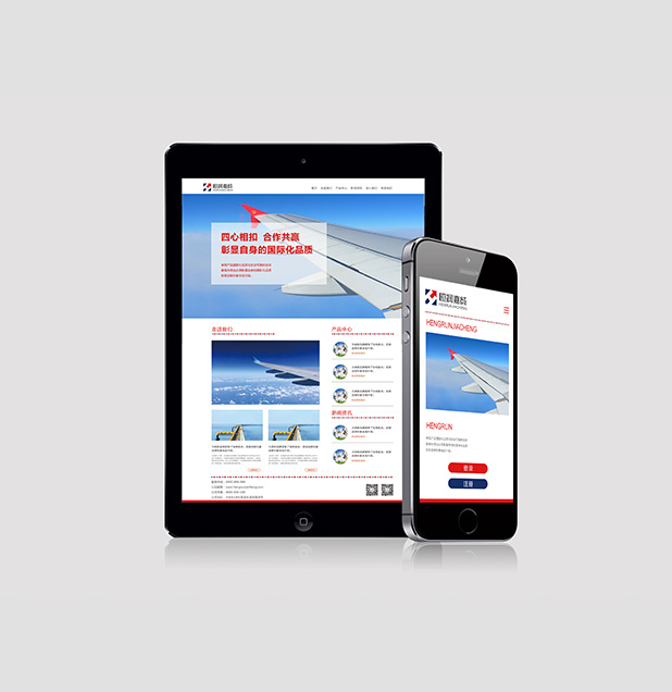
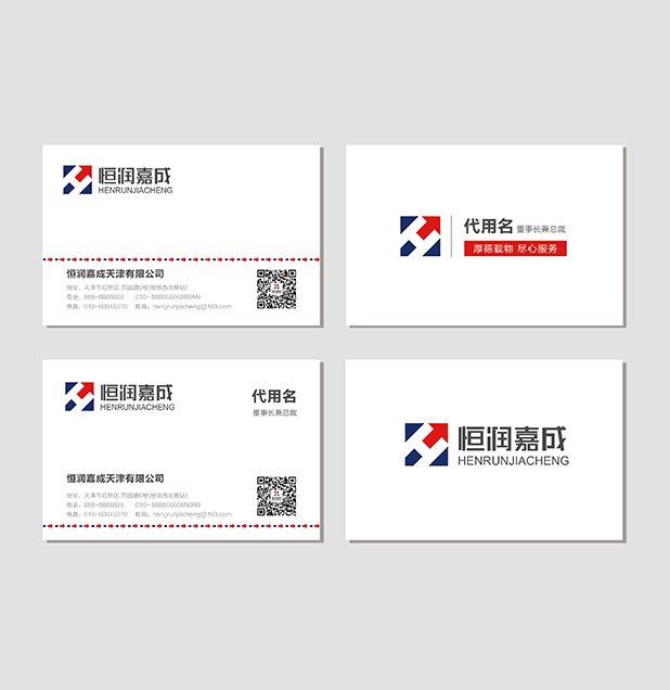
恒润嘉成的标志设计也是遵循了,守恒,大气磅礴的设计原理,该字体标志设计细节处理线条圆润且不失锋芒,即给人以发展的动势感、又不失稳重稳重大气之感。蓝色箭头的处理使字体标志整体形更具生命力和张力,寓意企业以稳健的步伐持续向前发展。方正的字形设计象征企业中正的企业文化也体现了企业雄厚的实力及他是稳健的发展步伐,箭头的处理展示了企业开拓创新的精神。标志使用蓝天和大海的颜色组合,天蓝色有睿智、开放、积极、包容之意,海蓝色有厚重、责任、坚韧、凝聚、稳定之意,天地都象征博大包容之感。
Extend:
Constant embellish jiacheng logo design is also followed, conservation, aka, the design principle of the fonts logo design detail processing line fruity and abilities, give a person with electromotive force of the development of the sense, and the feeling of losing stable stable atmosphere. Blue arrow processing make the font marked overall shape more vitality and tension, the enterprise sustainable development forward in moderate steps. Founder of the glyph design symbol of the enterprise is enterprise culture also reflects a solid strength and he is a steady pace of development, the processing of the arrow shows the spirit of enterprise innovation.Symbol using a combination of the color of the blue sky and the sea, the sky blue is intelligent, open and positive, inclusive of the navy has a thick, responsibility, tenacity, cohesion, stability, symbol of heaven and earth are broad and inclusive.