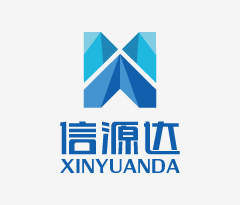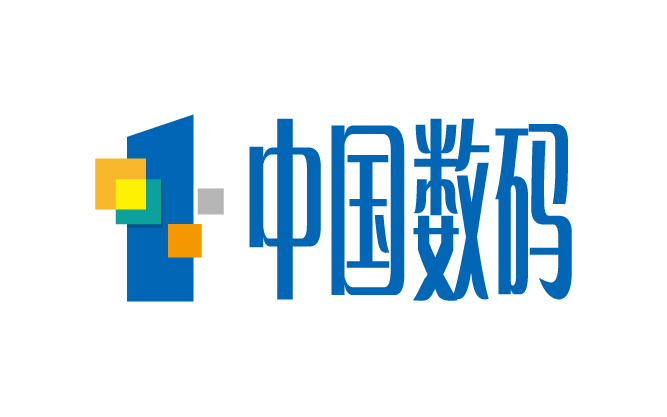
信源达
数字集群解决方案提供商
公司背景:
江苏信源达科技有限公司目标客户:安监、铁路、林业、卫生、物流、公交系统以及传统模拟对讲机用户,企业经营范围手机研发及制造、销售;计算机、通讯设备的制造;软件和信息技术服务;软件研发;信息技术咨询服务;通讯设备、电子产品;自营代理各类商品及技术进出口业务、国内贸易,天翼对讲终端、数字集群综合解决方案提供商,数字集群领域一流的终端产品供应商和应用方案提供商、解决商。
Company Background:
Jiang su Xinyunada Technology Co., target customers: safety supervision, railways, forestry, health, logistics,public transportation systems, and traditional analogradio users, business scope handset development and manufacturing,sales; manufacture of computer, communications equipment; software and informationtechnology first-class terminal importall kinds of goods and technology import and export business and domestic trade, Tianyi intercom terminal, digital trunkingprovider of integrated solutions, digital trunking fields; services; software development; IT consulting services;telecommunications equipment, electronic products product vendors and solution providers to address providers.


面临挑战:
先知创意团队经过周密的商业调研及与甲方管理层数轮讨论,核心问题聚焦在如何体现通讯设备公司的品牌气质,应该具有国际化、时尚感的品牌感受。品牌形象应给人以一种拥有崭新希望的感觉,以此寓意企业美好前景及光明未来。同时结合本产品的主要特点是科技与前瞻,未来感。所以整体形状是以可以用切面的形状为基础图形,其中每个独立的个体与整体有有机结合,同时要体现内涵的丰富性,另外要对信源达字体做独有字体设计。
Challenges:
Prophet creative team through careful management of business research and several rounds of discussions with the Party, the core issues focused on how to reflect the communications equipment company's brand qualities, should have international, stylish brand experience. Brand should be sympathetic to a have a new hope, as meaning a better business prospects and bright future. Combined with the main features of this product are Technology and Future, futuristic. So the overall shape of the section is to be used as the basis of the graphic form in which each individual has the combination of individual and overall, at the same time to reflect the richness of meaning, in addition to the source of the font you want to do a unique font design.
解决方案:
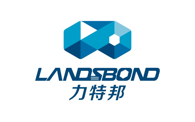
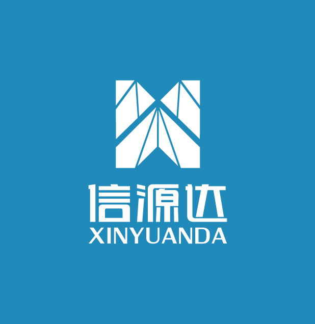
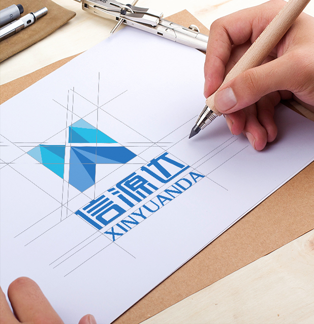
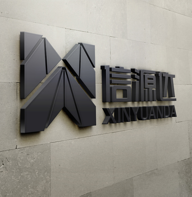
标志是由品牌名称的首写字母"X"为创意点进行设计。标志整体为一个科技时尚的大写字母X,图像下部又如锐意进取的向上箭头,体现一种激进开拓,共创未来的精神。 标志是由多个色块组成,这种模块式的组合代表企业的凝聚力与资源整合能力,传达了企业规范化、规模化的产业链形态。
标志由深浅不同的蓝色透叠而成,通透的色彩给人一种科技感与现代感,专注服务社会的责任感。标志的主色调和基本设计元素在视觉识别系统的设计上,使企业有个完整的突出的视觉形象。 整个标志看起来硬朗大气,端庄中不失灵动;巧妙的色彩选择使标志充满生气和活力。
Logo Explanation
Flag is the first letter of the brand name of "X" design creative point. Overall mark of a high-tech fashion capital letters X, the lower part of the image and if the up arrow to forge ahead, to reflect a radical development, create a better future spirit. Logo is composed of a plurality of blocks of color, this modular combination representatives cohesion and ability to integrate resources, to convey the business standardization, scale industrial chain form.
Flag consists of different shades of blue through stacked together, transparent color giving a sense of modern science and technology, focusing on social responsibility services. Primary colors and basic design elements logo design on the visual recognition system, so that enterprises have a complete visual image projection. Whole logo looks tough atmosphere, dignified yet clever; clever color choices so full of life and vitality mark.