
羽合服装
上海申达集团旗下品牌
项目背景
作为中国四大成衣出口商之一的上海申达集团,年出口海外成衣16亿件,为国外10多个品牌代工生产,为长三角区域200多家区域成衣制作厂商委托出口,如此规模,却没有自主品牌。随着市场竞争的进一步加剧,品牌化已经到了刻不容缓的地步。2007年,集团意识到品牌经营和传播的重要性,决定要创建一个完全拥有自主知识产权的品牌名称。要求有两套方案,一套在国内注册,专注国内市场;一套要具有很强的国际性,体现企业国际化特性。
为了能全面有效的塑建品牌,上海申达找到了先知中国,为其旗下品牌提供中英文品牌命名、VI设计、网站设计等一系列的全案支持。
Background of the project
As one of the China four apparel exporters Shanghai Shenda group, With the market competition further intensified, the brand has reached the point where it is. In 2007, the group realized the importance of brand management and communication, decided to create a wholly owned independent intellectual property brand name. The requirements of two sets of programs, a registered in China, focusing on the domestic market; a set to have the international sex is very strong, manifests the enterprise internationalization characteristics.
In order to fully effective modeling brand, Shanghai Shenda find the Wewin China, naming, for English brand, its brands provide VI design, website design and a series of case support.


面临挑战
申达的核心目标受众为25岁至35岁之间的,拥有中高收入的时尚白领阶层。这个消费群体文化水平较高,接受力强,消费潜力巨大;但突出问题是:国外品牌已 经让这个消费群体产生了很强的归属感。为了达成申达的愿望,先知在命名前期做了多次针对其目标受众的专业调查,结果显示:其目标受众对这个本土品牌有极大的认同感并表示出对其自主品牌的期待。
服装行业的竞争在整个经济市场上属于最激烈的行业,同质化严重,崇洋媚外现象严重。作为中国知名的本土品牌,如何能塑建自己的强势品牌,这是先知需要面临的问题。
Facing the challenge
The core target audience Shenda is between 25 to 35 years of age, with high-income white-collar fashion. The higher educational level of the consumer groups, to accept strong, huge consumption potential; its target audience in the early results show named: their target audience has great sense of identity and shown on the independent brand hopes for the local brand.
Clothing industry competition in the whole economic market belongs to the most competitive industry, the homogenization of serious, serious phenomenon of worship. As Chinese well-known local brands, how to mould their own strong brand, this is the Wewin need to face the problem.
解决方案
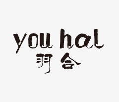
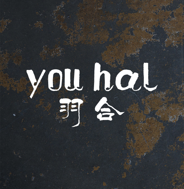
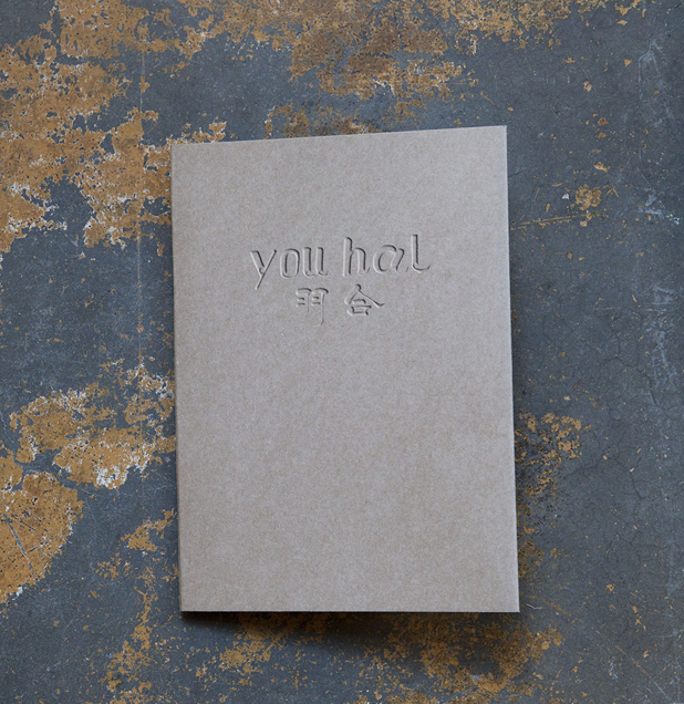
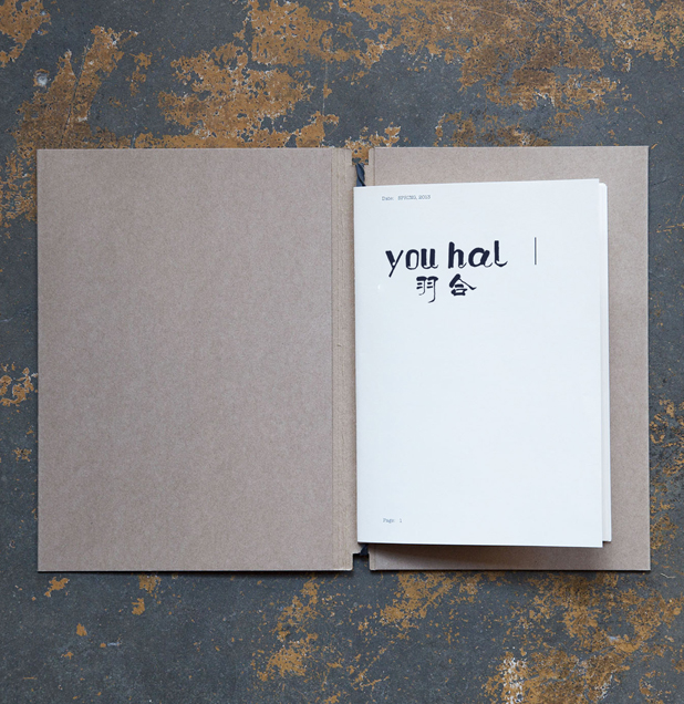
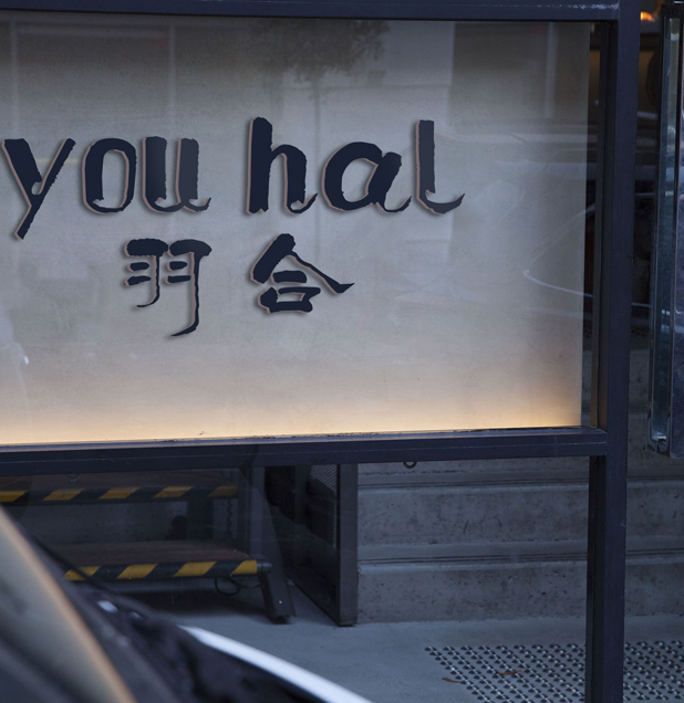
与申达的合作让先知对服装行业有了一个全面的了解和全新认知。“羽合”,名称自然、随意,是一种生活态度,它传递舒适、惬意和品质,十分吻合受众 的生活方式和生活理念。英文“米索卡”华丽高贵,有前卫、时尚、炫丽气质,与公司产品的诉求相一致。
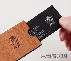
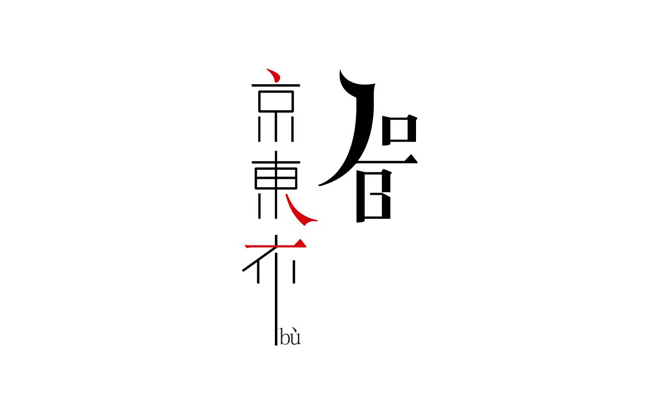
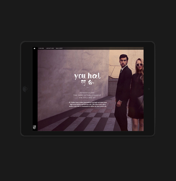
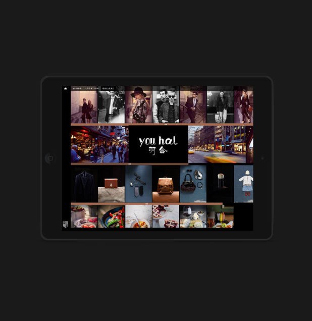
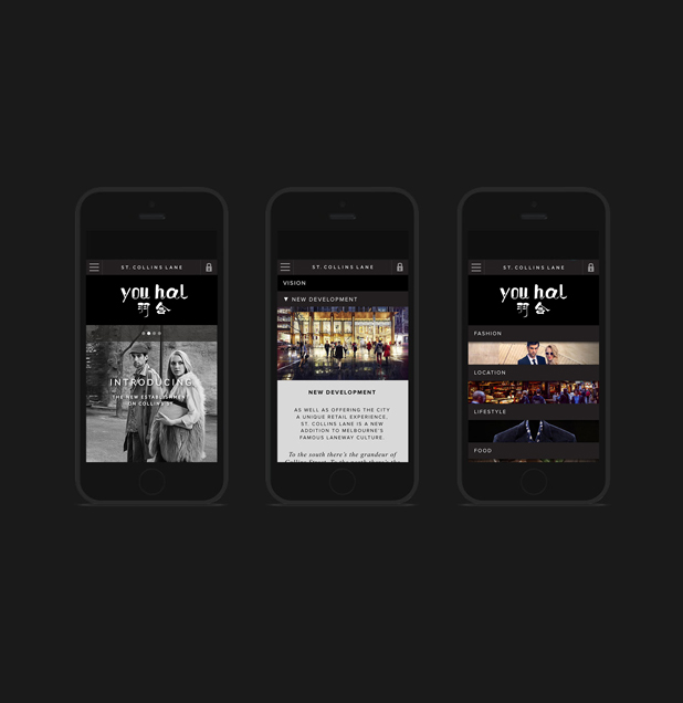
羽合的LOGO设计采用的是一种飘逸的字体设计,打造出一种轻盈的感觉;英文设计颇显大气,字体飞舞,让人联想到在空中翩翩起舞的白色羽毛。先知为其打造的网站采用了国外网站设计风格,时尚简洁但是不是失大气,给人以高端的感觉。整个方案的策划为羽合打造成功了其轻时尚、轻奢品的品牌形象,为其今后的发展树立了明确的航标。
The solution
And let the Wewins Shenda cooperation have a comprehensive understanding and a new cognition of the apparel industry. "Feather", the name of natural, casual, is a kind of attitude to life, passing it comfortable, cozy and very consistent quality, audience's way of life and life philosophy. The English "Misuoka" gorgeous noble, with avant-garde, fashion, beautiful temperament, consistent with the company's product demand.
Using LOGO to design the feather together is a kind of elegant font design, to create a sense of lightness; English design quite sensible atmosphere, fonts flying, reminiscent of the white feathers in the air rise and dance in a happy mood. The Wewin used foreign website design style for the building site, concise fashion but not lose the atmosphere, in order to give people the feeling of high-end. The whole scheme of planning for the feather together to build success of its light, light fashion luxury brand image, establish a clear navigation mark for its future development.